Most popular


Subscribe to our blog
Most recent

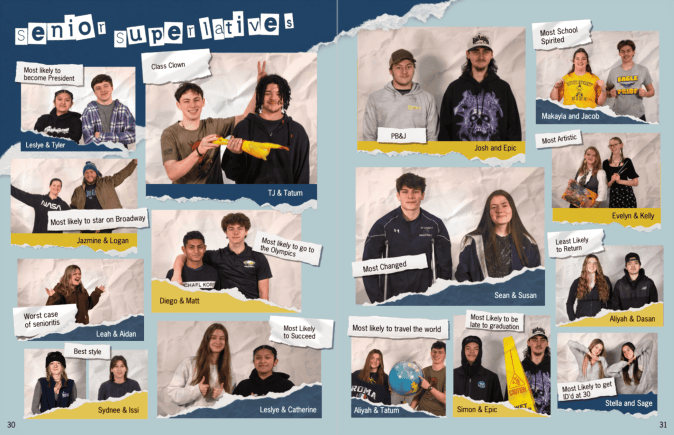
List of yearbook superlatives ideas for seniors & other students
When it comes to crafting memorable yearbooks, superlatives are a staple. These awards allow students to celebrate their peers in fun and lighthearted ways while preserving memories of who they were during the school year. However, the classic titles like Teacher's Pet, Most Likely to Succeed, and Class Clown—while timeless—can feel a bit overdone. That’s why we’ve curated a fresh list of over 100 yearbook superlatives that go beyond the clichés and embrace today's students' diversity, creativity, and individuality.
Senior Superlative Ideas for Any High School Yearbook
The best yearbook superlatives celebrate individuality and avoid focusing solely on physical attributes. By shifting the focus to creativity, character, and accomplishments, your yearbook can reflect the dynamic personalities of your class while creating moments of joy for everyone who flips through its pages.
And they are no longer just for your senior section. We're also seeing superlatives for elementary and middle school students plus teachers.
Superlatives For the Pop Culture Fanatics
- Future viral sensation
- Most likely to be verified on social media
- Most likely to get a deal on Shark Tank
- Next big TikTok trendsetter
- Future Marvel hero
- Most likely to direct an Oscar-winning film
- Most likely to write a best-selling YA novel
- Next reality TV star
- Most likely to produce a Grammy-winning album
- Most likely to host a podcast

Standouts for World-Changers
- Future Nobel Prize winner
- Most likely to start a nonprofit
- Best candidate for the CIA
- Most likely to be a UN ambassador
- Most likely to create a greener future
- Most likely to invent the next big thing
- Most likely to solve world hunger
- Most likely to lead a humanitarian mission
- Most likely to make space travel affordable
- Most likely to change the world through art
- Most likely to reform the education system
The Standouts in Personality
- Most likely to brighten your day
- Best advice giver
- Most likely to laugh at their own jokes
- Best at making new friends
- Most likely to win at trivia night
- Most likely to remember your birthday
- Most likely to cheer you up with a meme
- Most likely to have a cool hobby you didn't know about
- Most likely to be a secret genius
- Most likely to travel the karaoke circuit
Tech & Innovation Superlatives
- Most likely to work at a tech giant
- Future app creator
- Most likely to go viral on GitHub
- Most likely to build the next social media platform
- Most likely to win a robotics competition
- Most likely to design a sustainable city
- Future AI specialist
- Most likely to lead a virtual reality revolution
- Future cybersecurity expert
- Most likely to write the code that changes the world
- Most likely to build a flying car
Creative Superlatives
- Most likely to design a fashion line
- Future Disney Imagineer
- Most likely to illustrate a graphic novel
- Most likely to be a professional photographer
- Most likely to write/produce/star in a Broadway musical
- Future art gallery curator
- Most likely to star in a viral dance challenge
- Most likely to edit an award-winning film
- Most likely to open a boutique
- Most likely to host a DIY show
School-Spirit Leaders
- Most likely to plan the best reunion
- Most school spirited
- Most likely to remember every school tradition
- Most likely to stay involved as an alum
- Most likely to be voted into the Hall of Fame
- Most likely to name their pet after the mascot
- Most likely to preserve all their yearbooks
- Most likely to organize the class group chat
- Most likely to wear school colors forever
- Most likely to volunteer at every school event
- Most likely to return as a teacher
Celebrate Explorers and Adventurers
- Most likely to backpack around the world
- Most likely to climb Mount Everest
- Most likely to be on a national geographic cover
- Most likely to travel in a tiny home
- Most likely to road trip across America
- Most likely to work on an antarctic research base
- Most likely to be a wilderness survival expert
- Most likely to discover a new species
- Future travel blogger
- Most likely to live on a sailboat
Humanitarian Superlatives
- Most likely to be a first responder
- Most likely to work in public health
- Most likely to foster rescued animals
- Most likely to start a free library
- Most likely to volunteer internationally
- Most likely to champion mental health awareness
- Future advocate for marginalized communities
- Most likely to win a humanitarian award
- Most likely to organize a food drive
- Most likely to host fundraising galas
Superlatives that Celebrate Unique Skills
- Most likely to master a new language
- Most likely to memorize the entire dictionary
- Best at solving a Rubik’s cube
- Most likely to train a pet for tv
- Most likely to start an e-sports team
- Most likely to be a Guinness world record holder
- Most likely to excel at any board game
- Most likely to master culinary arts
- Most likely to be a pro dungeon master
- Best at remembering random facts
Community Superlatives
- Best neighborhood organizer
- Most likely to run for local office
- Most likely to open a community center
- Most likely to start a neighborhood tradition
- Most likely to build a successful co-op
- Most likely to run a food truck everyone loves
- Most likely to revitalize a downtown area
- Most likely to be a local celebrity
- Most likely to mentor future generations
- Most likely to make everyone feel included
Athletic Superlatives
- Most likely to be in the Olympics
- Most likely to compete in the X-games
- Most likely to coach a championship team
- Best teammate
- Most likely to design athleisure wear
- Most likely to become a fitness instructor
- Most likely to run a marathon on every continent
- Most likely to be a sports journalist
- Most likely to win a Superbowl/Stanley Cup/World Series/MLS Cup/NBA Championship
- Most likely to build an inclusive sports league
- Most likely to train the next MVP
- Most likely to win a Heisman
How to Choose the Right Superlatives for Your School
When brainstorming yearbook superlatives, consider your school’s culture and student body. What resonates with your classmates? Are they passionate about social causes, obsessed with pop culture, or deeply involved in athletics?
Here are four tips to guide your process:
- Survey students: Your yearbook team should come up with the categories and the student body should nominate the winners.
- Focus on positivity: Avoid potentially negative or divisive categories.
- Stay relevant: If you arent using your theme to determine which superlatives to offer, incorporate trends in technology, media, and culture to keep your list fresh.
- Celebrate achievements: Recognize contributions across academics, arts, athletics, and community involvement.
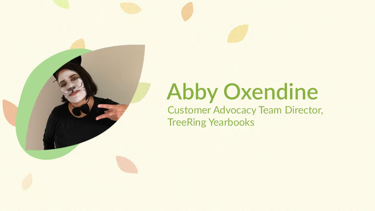
Yearbook hero Abby Oxendine helps 100s of advisers (that was just today)
Treering Yearbook Heroes is a monthly feature focusing on yearbook tips and tricks.
Meet Abby, Treering’s Community Advocate Team (CAT) Director. Not only does she advocate for schools and parents who need support, but she also advocates for the team she leads by creating a positive, proactive environment.
Do you have a yearbook story for us?
In 7th grade, I won the athlete of the year superlative. The photographer set up her photoshoot after a workout and expected me to do a chin-up. I was a swimmer. The resulting image showed me with my tongue out, hair in disarray, and shirt pulling from my shorts. It told people, “I’m a great athlete, but a mess everywhere else.” I always wondered why they didn’t photograph me in my element, the pool.
And thus, you began fixing yearbook issues! You’re in the midst of our busiest season because April through May are when our spring deliveries go to print.
Yes, this is my favorite time. I started hyping up the team in January by letting them know we are approaching the final stretch. It’s now, in the 11th hour, when customers are putting the final touches on their masterpieces and inevitably things are going to go wrong.
Last summer, we increased our permanent staff to better serve customers. We also increase seasonal help during this time and extended the hours phone and email support are available.
What other new initiatives have you begun?
We are constantly evolving. In fall, we started Welcome Walk-Throughs for new yearbook editors so they are ready to cheerlead their own book. During these one-on-one sessions, an advocate goes over page count, shipping, dates and deadlines, yearbook promotion, and how to engage the school community, set up folders/photo storage, complete portrait autoflow, and go print ready. It’s a lot! We really want to build confidence.
Every day, we learn from customers, and many updates to the app or new themes have come from them!
How does it feel to see your ideas in motion?
We are just scratching the surface! Last year, I wanted to do something fun for our customers and recognize our community by rewarding them for doing a great job and for all the hours they put in. The #TreeringMemoriesMatter came from that. I’m excited to see how it expanded to the #YearbookHero and #TreeringMemoryMaker contests.
There are always things we can do along the way to help people smile. Whether it’s these large-scale contests or telling yearbook editors what looks great in their books—it’s about kindness. Our customers put hours they don’t have into their craft.
When people think of “support,” they probably envision a cube farm with a bunch of headsets and scripted responses. How is Treering Yearbooks different?
The work culture at Treering Yearbooks is what attracted me to the company in 2012. Our focus has always been on customer service. When most help centers have a “turn and burn” philosophy, Treering doesn’t monitor call times. Our advocacy team is trained to anticipate future needs and educate editors. I tell them, “Answer the unasked questions.”
Every year, satisfaction surveys consistently mention how much yearbook editors and parents appreciate the focused time they receive on the phone from our agents.
If you could tell a Treering yearbooks customer anything, what would it be?
The CAT team is here to help you every step of the way in your yearbook journey and we are here to help you when you are overwhelmed. There’s no limit to what we won’t do for them (in the yearbook).
Operative phrase: In the yearbook. Visit/favorite/bookmark help.treering.com for more.
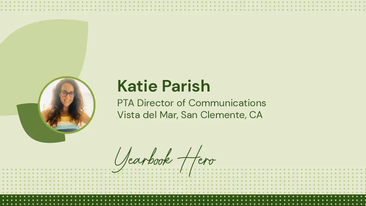
Yearbook hero Katie Parish talks contests, empathy
Not every yearbook coordinator is an Emmy Award winner, but Katie Parish is. The gold hardware on a shelf over her shoulder should be intimidating; after all, Katie knows the value of a quality interview. Two seconds in, and I’m completely disarmed as we talk about volunteering, yearbooking, and being WFH moms.
How did you move from the newsroom to the classroom?
I retired from my television job when my daughter started kindergarten, and I needed something to keep me creative. A lot of people shy away from the PTA, but I really found a wonderful community and was like, “Can I please help make the yearbook?” I started small, just helping with some of the pages.
A lot of people shy away from the PTA, but I really found a wonderful community and was like, “Can I please help make the yearbook?”
Tweet
When we moved schools, I was helping with social media, and the yearbook mom disappeared. I just jumped in and I instantly loved Treering so much. It was so easy to use I totally got it. While I had some previous experience, it just was so much better than the platform we had at my previous school. You have immediate access to photos when parents share them and there are a plethora of graphics and fonts. It’s super simple to lay out the pages and add graphics.
Over 80% of your school community bought yearbooks last year. How did you do it?
My community is a late adoption community: they upload pictures late and they buy books late. I actually leave holes in my spreads because I know I’m gonna be getting more photos second semester.
Over a two-week period, we promoted a class contest. We said whichever class buys the highest percentage of books the week after spring break will win a sweet treat party and the teacher will receive a $25 Target gift card. It’s really important when you have teacher buy-in. The winning class sold 100%, the next one was at 98%.
I love the idea of a marketing contest. How else do you involve the school?
On Halloween, our principal dressed up as Where’s Waldo. I mean, what was I supposed to do? I put him on 13 pages in the book and the kids had to find him. That was just a little interactive thing, and that’s something else that’s so fun about yearbook: it’s organic. During the year, you can build into the book and make align with your community in this specific moment.

We always do a cover contest. Students draw something school related and they have always had to include the name of the school, our key words—Ready, Responsible, and Respectable—and the year. The yearbook committee narrows it down to the top 20, and then the PTA narrows it down a little bit further. The teachers and front office staff, admin, everybody who helps run the school, gets to vote on the winner. I paste all the final covers onto some poster board and have them available to be seen in the office. Then, the winner goes on the front, and the six runners up on the back cover.
Next year is the school’s 20th anniversary, which is the platinum anniversary. So we’re gonna do some silver foil on the cover.
How does your experience as a yearbook coordinator help in your role here at Treering?
Because I work full-time as a Customer Success Manager and I have two kids that I have to run all over creation, and I still volunteer for the PTA, I know what a busy plate looks like. I can help editors prioritize and schedule their yearbook lives, and help them figure out what they should be working on and when so that we’re taking small bites out of the book at a time.
We start with planning out their ladders which translates into an accurate page count and shared photo folder organization. Do you know what’s so great about crowdsourcing? This could be a whole yearbook about your kid, but when you have that option for everyone to contribute, and you make it easy for them to access it, it just gives you so much more diversity in your book of faces.
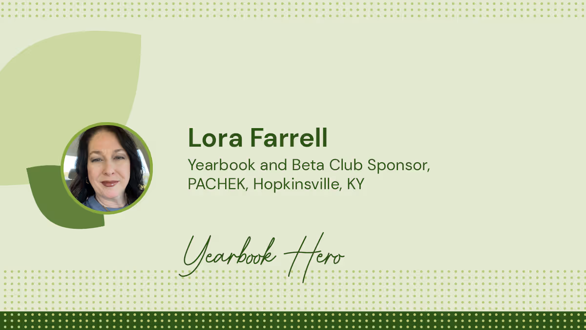
Yearbook Hero Lora Farrell
Treering Yearbook Heroes is a monthly feature focusing on yearbook tips and tricks.
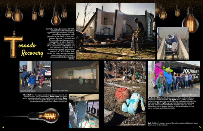
One of the 18 tornadoes crossing Kentucky in December 2021, an EF-4, the deadliest tornado in the Commonwealth's history, devastated towns in the southwest corner. Pennyroyal Area Christian Home Educators of Kentucky (PACHEK) students delivered food, assisted with clean up, and served with various faith-based relief organizations in Pembroke, Mayfield, Bremen, and Dawson Springs, KY. Yearbook volunteer, pastor’s wife, and homeschool mom Lora Farrell first caught our eye when she submitted her yearbook team’s spread, detailing both the devastation and the work to right it all in the 2022 Treering Design Contest. They won second place.
How does it feel to go from second place to first?
That was really shocking because I almost didn’t even enter. I really loved the spread we entered last year and I felt there wasn’t a spread this year (yet) at the same level of my personal satisfaction. It was such a fun surprise to be a finalist.
We are leveraging the free yearbooks we won from the contest to incentivize donations for our Beta Club fundraiser. We are partnering with Funds2Orgs for a shoe drive. We collect shoes, and they pay us per pound. The shoes then help micro-entrepreneurs in developing nations build their businesses and the money we raise will help students attend Beta’s national convention.
Let’s talk design. How did PACHEK choose Groovy for their 30th anniversary book?
The students really liked the design and we wanted to do something throwback. It’s not 90s, but the 70s seem to cycle back through every 20 years or so and it just works.
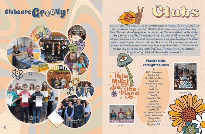
On our divider pages, we used photos from previous years along with a paragraph with a little bit of group history. The team and I reached out to older members of the community. Because we are near Ft. Campbell, there is a large, transient military population. It was tough to get some photos as a result. Most are the ones I’ve taken over the previous 12 years. We did include interviews with older members of the community since digital photos weren’t the norm back then.
How do you build a 124-page book in a homeschool environment?
Yearbook is strictly a volunteer job. We currently have four students who build the book and two moms training to take over as sponsors. As part of our campus culture, there is naturally lots of photo sharing in the group: people share at the end of the day or after a field trip—it’s automatic.
During each co-op module, we meet twice a month. Between these sessions, it’s once a month. We break down tasks throughout the year to curb procrastination. I leave notes on the spreads in the Treering app. The students are intrinsically motivated and I like to give them a little extra with parties and food during work sessions. We also do a year-end celebration when the book arrives.
What tips do you have for someone just getting started as a yearbook club adviser?
Don’t be afraid: the software is user-friendly and there are resources available. With our previous company, I had to use a lot of outside resources. In Treering, I can set margins and page styles. I love the new folder features where we can add subfolders and share between folders.
The biggest thing is to be consistent throughout the year by managing the workload.
Fresh ideas for yearbook spreads highlighting your teachers
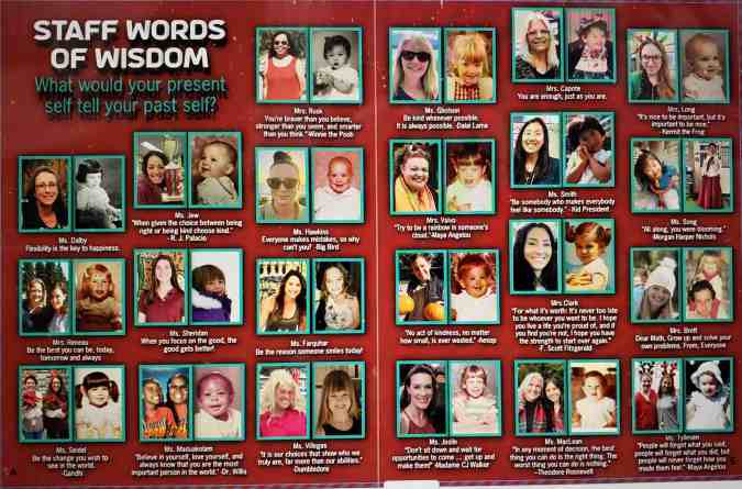
Teachers are the greatest, so you don’t want their yearbook pages to fall flat. The one thing teachers truly deserve (besides a raise) is an amazing yearbook spread or two. So let’s give these hardworking folks their due and give the student body something to talk about by including fun and clever teacher spreads in this year’s book.
Here are some fresh yearbook spread ideas to capture a more dynamic view of your teachers and staff on your book’s pages.
Throwback
Did you know that teachers were once students themselves? Well, of course. But this concept might be mind-blowing to some of the students at your school. Ask your teachers to submit images of themselves when they were the age of their current students and give a little insight into what they were like.
When I was a junior, our Chemistry teacher showed us a commercial that he starred in when he was a high school track star. It was hilarious (those shorts!) and it gave us a glimpse into our teacher’s background.
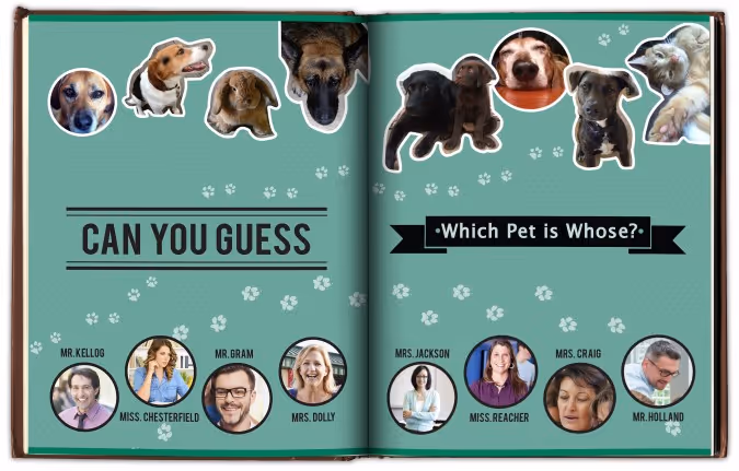
Teacher’s pet(s)
Create a collection of photos featuring your teachers with their adorable animals. Whether it’s a poodle or a piranha, there is a lot to be discovered by displaying these companions. To add some dimension, you could create a mod displaying quotes about different teacher’s childhood pets. Another idea would be to create a guessing game where you have to match the pet to the teacher.However you style it, animals are a big hit.
Just like us
Teachers seem like a different species to your students sometimes. So for a spread to tie everyone together, gather some similarities between your teachers and the students. You might have to poke around a bit, but you won’t have to look too far to find some teachers that enjoy a snow day, Taco Tuesday, or cheering on the team. Teachers stay up late to finish their work, play games on their smartphones, and like to get all decked out for Halloween. Finding similarities between the teachers and students will remind the reader that they are all part of a tight-knit community.
If I wasn’t a teacher
Poll your teachers on what they thought they were going to be when they grew up. Pick some of the best responses and use illustrations or Photoshop to make these ideas come to life. Everyone will get a little chuckle out of seeing their favorite teachers outfitted as cowboys, astronauts, soccer players, or mad scientists.
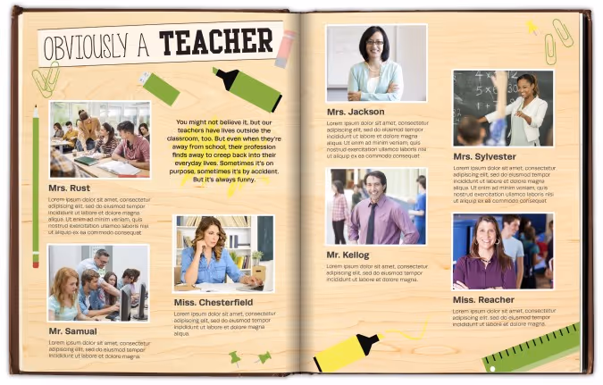
Obviously a teacher
A while back I was out to dinner with my sister. She reached into her pocket to retrieve her chapstick and managed to fish out two glue sticks and a flashcard. I immediately glanced at her inky fingers and the pencil in her hair. She was such a teacher at that moment.
So for an ‘obviously a teacher’ spread, ask teachers to identify their own moments like these and photograph the evidence. Whether it’s the day they realized that all their shoes were built for comfort or when they referenced their nephew being born “last semester,” every teacher gets the self-realization epiphany now and then. These moments are usually marked by a quick giggle; make room to share the laughs in your yearbook.
Two truths and a lie
It’s a simple game, on the surface: each participant provides three statements–two are true, and one is false. It’s up to everyone else to determine which is which. And it’s a great idea for a spread about your teachers.
Ask teachers to craft their three statements, and have them pose for the camera with their best poker face. Whether you include the answer key is up to you, but we’d recommend hiding the answers somewhere in the ads. For additional photos, you can show a mix of the facts and the fantasy for a really fun and creative spread.
The annual yearbook is a great platform to show your teachers’ human sides and cement a lasting impression for years to come. The best spread ideas contain an unexpected, personal glimpse into the teachers’ lives. So step away from the blackboards and apples, and provide a new, exciting spread.
Your goal is to add another dimension to the teachers that all work so hard educating today’s students. These teachers are wholly invested in their students’ futures, and the yearbook should be equally tenacious in capturing our teachers in their best light—as themselves.

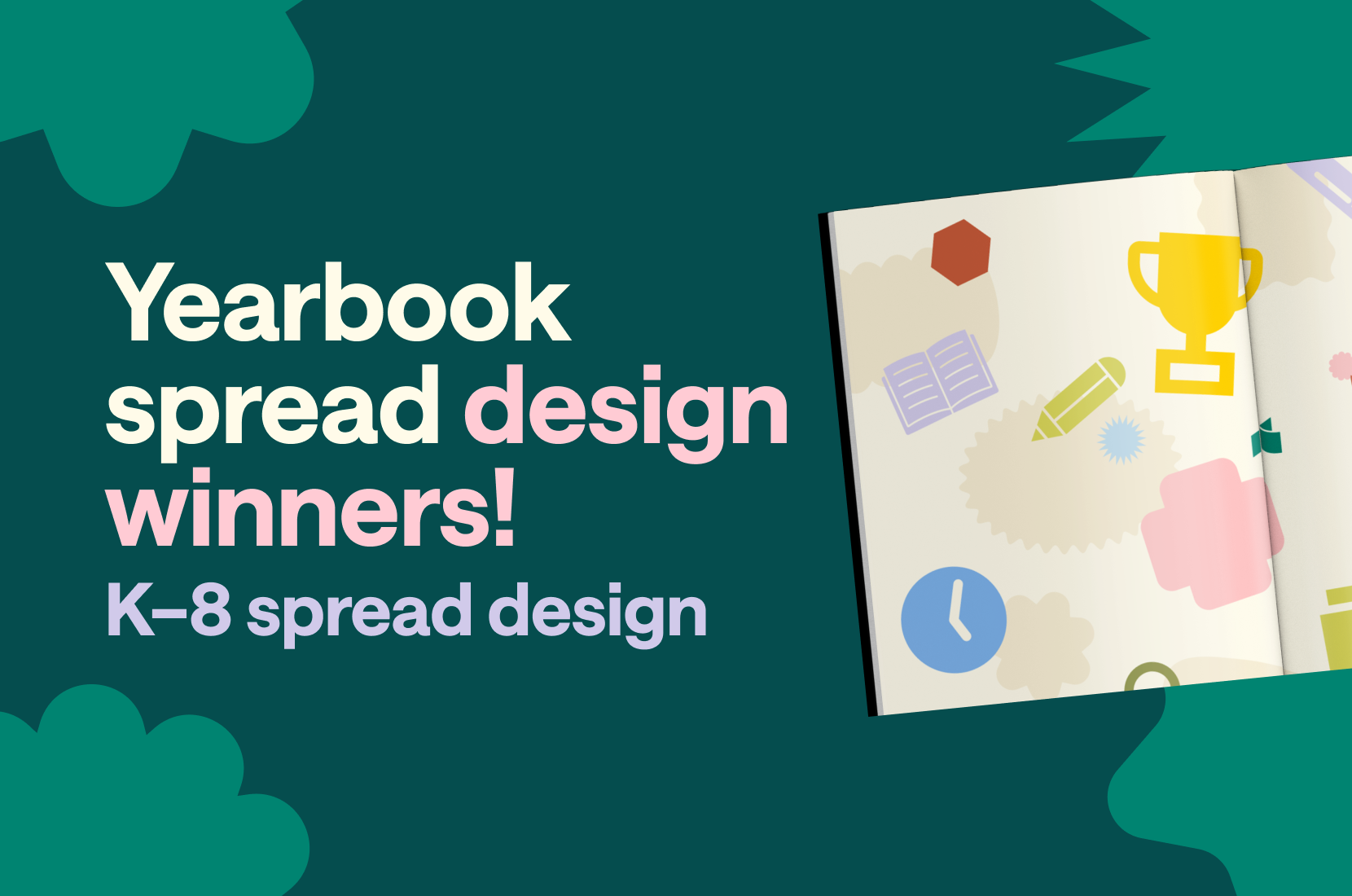
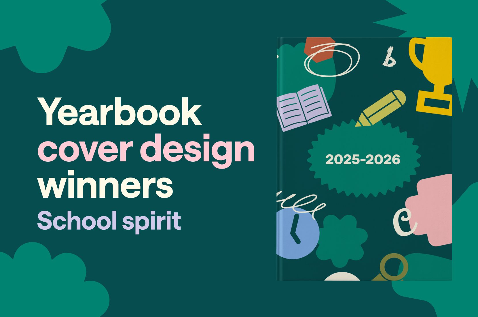
2025 custom page design contest winners
You, too, believe every child deserves the spotlight. And when you took on the open-ended challenge to celebrate in style, your creativity, honesty, and heart were on full display.
We're honored to showcase the showstopping designs and the stories of the creators who brought them to life.
Grand prize winner
Narrowing down over 1021 entries to the top 100 took two days. We reviewed every submission carefully, appreciating the heart behind each one. Designs that went beyond the template rose to the top because they had personal touches.
In each round of evaluations and re-sorting, one spread stood out and eventually became the $500 Grand Prize Winner.
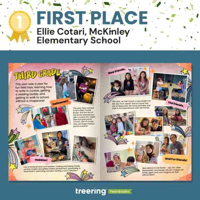
Why we loved it
It showed how design can be energetic and balanced. Both the warm colors and shooting stars are lively.
"It screams, 'third grade,'" a judge said.
And yet, with all that is going on, the main entry point is still the headline, and your eyes move in a circular pattern. There are verbal guides to highlight the five main sections. Cotari keeps it grounded by using a consistent photo style and typeface.
Cotari said, "It matches [my daughter's] personal style, hobbies and interests, and her playful personality!"
POV: people sent their favorite moments and somehow they're OURS too!
Nearly all the submissions captured a different perspective: students shone across academics, athletics, and activities. Grandparents held places of honor and remembrance. Together, we gushed over pet pics and cried over stories of overcoming trials. Check out the top 100 submissions before seeing the Big Ten.
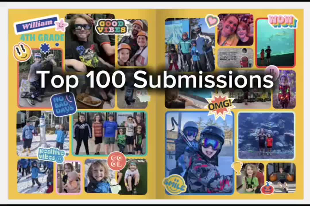
Thank you for embracing the spirit of Treering's custom pages and giving your child the spotlight.
Custom page design contest finalists aka the big ten
A group of judges combed through the top 100 to create the top 25, then top 15, and finally, the top ten. Each of the runners up earned a $50 Amazon gift card for their visual interest and originality.
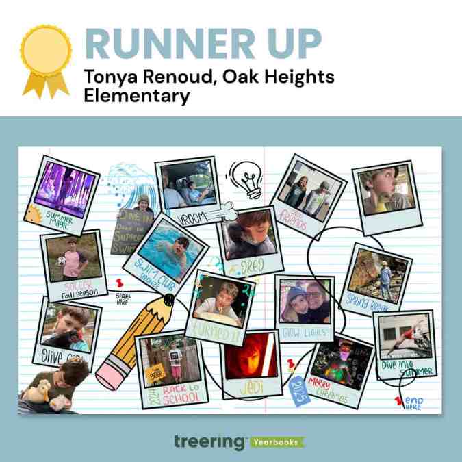
Tonya Renoud, Sweet Home, OR
Why we loved it
Renoud had us at start here.
"When he looks through these years later, he can walk down memory lane," she said.
This is exactly what she gave us. There is a path peppered with highlights from the end of summer to the start of next summer. Pets—this might be our first-ever duck submission—are especially timestamps in childhood.
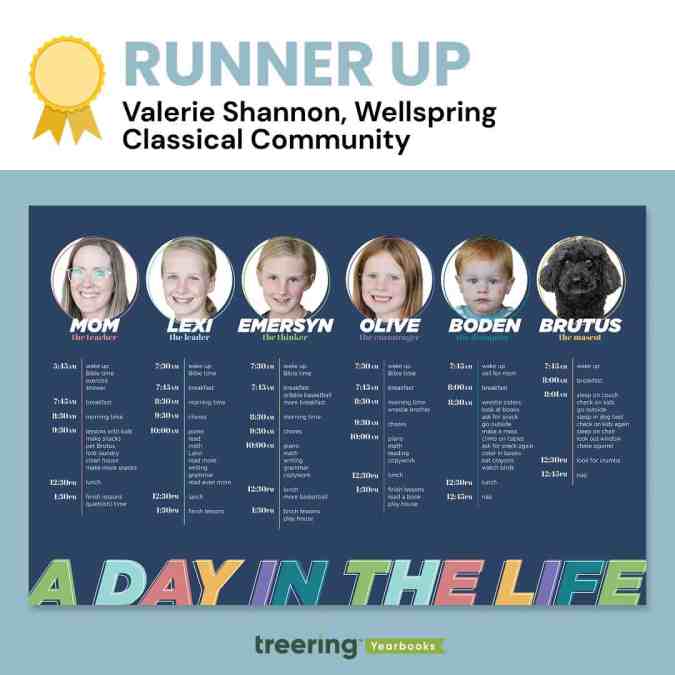
Valerie Shannon, Findley, OH
Why we loved it
Brutus and Boden.
At a glance, these two family members stand out because of their cute factor. Once we stopped to read, Shannon won us over with her tongue-in-cheek copy, which she called a "fun peek into our homeschool day."
"The theme of this year's contest was 'Every Child Deserves the Spotlight,'" a judge said, "and she managed to use her spread to give four kids, the dog, and herself a moment to shine."
Shannon's design is clean despite being full of copy. We love how she chose a color palette and anchored each family member's daily routine with one color using a tool line and circular frame. Both the frame and the knockout on the heading text are offset. It's these little details that elevate the design.
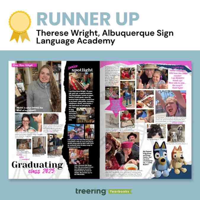
Therese Wright, Albuquerque, NM
Why we loved it
This was one of two magazine-style custom pages that captivated us. We loved the torn elements and how Wright used the black paper to highlight moments from her daughter's senior year. For Wright, these design elements held further meaning:
"Torn pages with rough edges, curving tracks, splashes of pink (representing moments of easier breathing) brighten up the darker moments that have strung these ups and downs together and keep her rock 'n rollin toward an unknown future, able to face each new challenge and sing, 'I am ready! Hold Tight!'" Wright said.
The watermarked roller coaster further illustrates the Wright Family's journey, which began with a 17-month ICU stay. Despite countless hospitalizations, communication barriers, and daily health challenges, Wright's daughter has persevered with strength and joy, communicating through American Sign Language and music.
This is the ultimate senior celebration.
"Albuquerque Sign Language Academy gave her a voice in the world and a place to belong from 1st grade to 12th," Wright said.
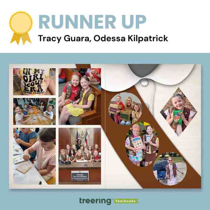
Tracy Guara, Katy, TX
Why we loved it
The photos as badges caught the judges' eyes, as many identified with this milestone as troop leaders or former Brownies.
"This is a moment in time," said a judge. "It's exactly what custom pages should be."
Guara's daughter is a fourth-generation Girl Scout who achieved badge and cookie-selling goals.
"I was honored to create this spread mimicking a Girl Scout Brownie sash," Guara said.
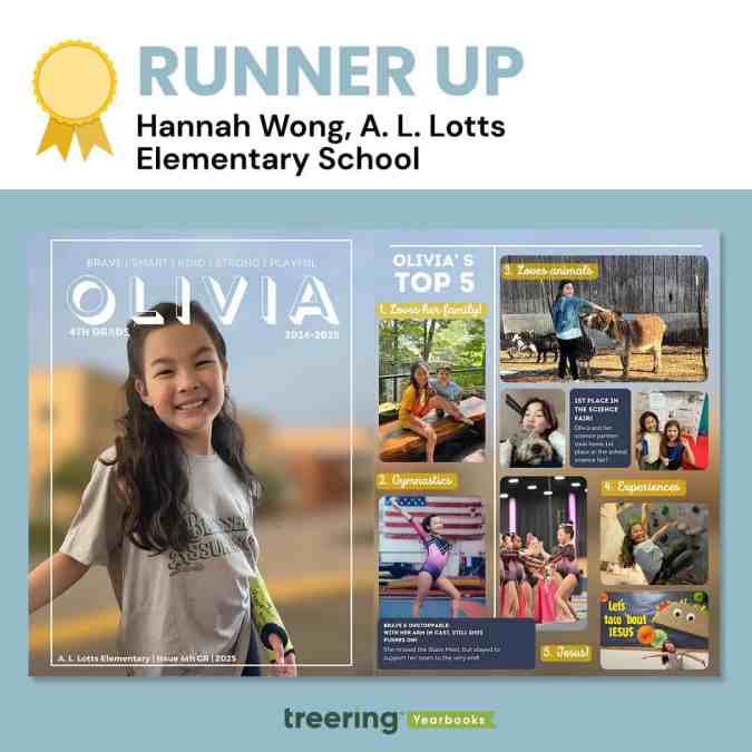
Hannah Wong, Knoxville, TN
Why we loved it
It looks complicated.
"This spread is not just a collection of photos and milestones," Wong said, "it's a heartfelt tribute to her dedication, growth, and the pride I feel as her parent."
The layers made it rich. With a single photo as background across the spread, Wong layered photos, editable shapes, and textboxes to create this magazine-inspired look. Even with all the content, she maintained alignment in her columns (the designers really geeked out over this) and pulled color from the background to connect the top five headlines.
While it looks complicated, the layout is clean and straightforward to recreate with Treering tools.

Dana Denning, Albuquerque, NM
Why we loved it
Everything points us into the spread.
Denning's choice and use of graphics here are masterful: the plane is flying toward the center, the arrow points to the center, and even the shadows on the skyline at the base of the spread lead toward the center. Additionally, her spread uses a design hierarchy we don't see outside of traditional yearbook pages.
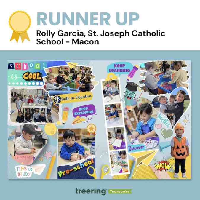
Rolly Garcia, Macon, GA
Why we loved it
It's cliche, but this spread truly put the cool in school. With playful colors, encouraging graphics, and photos of highlights in- and outside the classroom, Garcia captured the spirit of early childhood education.
"The filmstrip has those fine motor milestones in the classroom," said an educator-slash-judge. "We see pencil grip and dexterity skills developing."
Garcia said, "A notable element in the design is the paper airplane, which symbolizes the concept of 'soaring'—reflecting the idea that when students learn and grow, they are empowered to reach new heights."
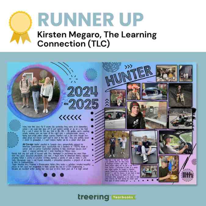
Kirsten Megaro, Great Meadows, NJ
Why we loved it
Megaro's extra touches of texture made us want second, third, and thirtieth looks.
"I know this was made in the Treering app," said a judge, "but I can't help but think it was first a pen-and-ink creation in a notebook during math class."
The judges loved the rectangle at an angle, the use of circles, and the font choices. They also emphasized the black scribbles and frames, which brought clarity to what could have been a complicated visual.
"We want to celebrate and remember the 'regular' moments of life," Megaro said, "not just the school-related stuff, so these pages allow us to do that and we love being able to look back on them from year to year."
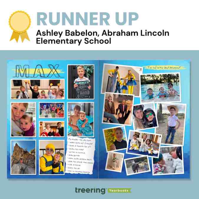
Ashley Babelon, Chicago, IL
Why we loved it
Max's kinder to-do list became an "eye spy" moment for us. We wanted to see if he ticked all the boxes. (He did!)
"Max also loves 'Toy Story' and Minions, and so the color scheme and font act as a mini time capsule of the things our little boy loves right now," Babelon said.
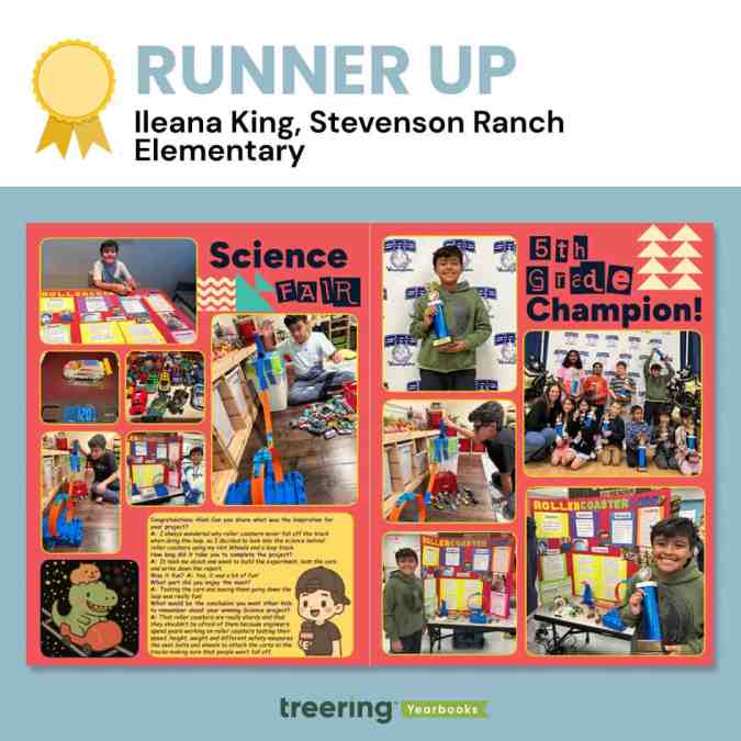
Ileana King, Stevenson Ranch, CA
Why we loved it
From the interview to the before-during-after photos, we loved the depth of coverage on this spread.
King said, "To add a fun twist, I used AI to create the sticker of a capybara and a T-rex, two of his favorite animals, riding a roller coaster. Then I added Treering graphics to make it look like Space Mountain, which is my son's favorite roller coaster."
One of the judges said, "This is one of the things you pull out when a future daughter-in-law comes over."
Thanks to all who entered and shared their story with us.

Treering coupons: get a great deal on your school yearbook
Here at Treering, we keep school yearbook prices simple. Your yearbook pricing has two factors: page count and cover type. With this all-inclusive approach, there are no minimum orders, shipping costs, contracts, or hidden fees to consider, and your team will have access to everything they need (templates, design tools, support, and more). This way, you don't need to go searching all around the internet for "Treering Coupons."
But if you did that—and ended up here—we'll give you the inside scoop on how we approach discounts, so you know when and how you can save money.
Treering coupons for parents and students
Treering discounts school yearbook prices in the fall. This early purchase discount is a marketing tool for advisers to gain momentum for book sales and it helps parents lock in a great price. We think it’s a win-win-win.
Here’s how the discount schedule works:
- August: 10% off
- September: 10% off
- October: 10% off
Because these discounts are automatically built in, parents and students don’t even need Treering coupons to take advantage of the deal. They’ll automatically get the sale price when they pre-pay.
Treering coupons for yearbook advisers
When yearbook advisers work with Treering, they can score their friends a great deal on their school’s yearbook prices while also earning free books for their school.
Here’s how it works:
- Yearbook advisers using Treering share their special referral coupon code with friends and fellow yearbook advisers.
- When yearbook advisers sign up their schools with Treering for the first time, they can use that special coupon code to receive 10% off their school’s yearbook prices.
- The yearbook advisers who shared the code earn up to 10 free yearbooks for their school each time those new schools sell their first yearbook through Treering.
Not using Treering for your school yearbook?
Treering has helped more than 20,000 yearbook advisers do really cool things with their yearbooks without their efforts feeling like a full-time job. We’ll show you how we can do the same for your community.

Teaching yearbook: making a marketing plan
You’ve heard the adage, and likely uttered it yourself: fail to plan, plan to fail. That advice works whether you’re saving for retirement or just trying to get yearbooks in the hands of students across campus. It’s also why you need a yearbook marketing plan (and all the free tools below). It may seem backward to start marketing a book that hasn’t been finished yet but this is the best time to create a plan and put it into action.
Three ways to start your marketing plan
1. Set your goals
SMART Goals are prevalent in the ed world. My favorite principal once said, “We tell students they can achieve anything. But if I want to be an astronaut, I can’t just go into space tomorrow.” (There’s that planning need again.)
Reverse engineering the school year and yearbook production cycle will help you achieve your goals.
Here are some examples of SMART goals:
- Sell XX amount of yearbooks by November 15th
- Increase Recognition Ad sales XX% by April 15th
- Increase all Yearbook sales XX% by May 30th
2. Create a calendar with important dates
We created this yearbook marketing calendar so you can plot important dates while creating a schedule that fits your school (and your sanity).
3. Recruit your team and delegate tasks
For each campaign, spread out the responsibilities. Using a marketing campaign template will help you stay organized by listing the budget, design development, communication modes, important dates, and who is responsible.
Customize your yearbook marketing plan
Know your audience. Toastmasters has been preaching this one sentence since 1924 and it’s worked out well for them. Determine who wants what you are selling and why. Below, we've literally taken a page from Marketing Unstumped, Treering’s guide to yearbook marketing.
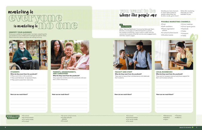
Because the same message will not resonate with everyone, you want to spend time understanding what the message is for students, parents, faculty, and local business owners. Then, go find them.
Identify your best channels to reach each audience section where they live. In other words, go to them. Utilize all the marketing channels you have available to you and evaluate which ones work best for which audience. Possible marketing channels include:
- Staff newsletters
- All-call services
- Parent organization website
- In-school bulletin boards
- All-school events
- School meetings
- School sports games
- School arts events
- TikTok

The benefits of joining yearbook committee for students
Yearbook committee is a great activity for students to get involved with, but not all students know the benefits that it can bring them. Plan ahead for next year by planting the seeds in students'heads now about why they should seriously consider joining in on the yearbook fun next year.
Drive home to them that some of the benefits of joining the school’s yearbook committee include:
Getting involved
Not every student is into sports or possesses musical talent. But that doesn’t mean that they can’t get involved with their school. Joining the yearbook committeegets students involvedon all levels – from mingling with students, to attending school events, and actively participating in something that benefits the entire school body. Students benefit from yearbooks just as much as the schools do in creating a positive school spirit. And when kids have school spirit, they perform better as students.
Teaches crucial life skills
Deadlines, deadlines, deadlines. A yearbook staff is never short on deadlines. But even though they sound stressful, deadlines can be very beneficial in helping students learn skills that they will use through school, college, and the rest of their lives. Time management, prioritizing, reliability, and the responsibility of following through on tasks when others are depending on you are just the tip of the iceberg of skills that students learn when working on a yearbook.
Provides writing and journalism experience
Writing copy for yearbooks is a lot harder than it might originally appear. When students are forced to use rules of proper attribution, go through an in-depth interviewing process including follow ups, or are crafting a creative piece, they build upon the fundamentals that they learned in English class. Practice makes perfect and the more you write, the better you get at it.
Provides creative experiences
Photography, Photoshopping, page layouts, yearbook themes, design ideas – putting together a yearbook from start to finish is full of tasks that get the creative juices flowing. It’s very rewarding for students to have the physical proof to show for all of that hard work they put in over the course of the year. When anyone first starts a project, it’s easy to get lost in all of the details. But being able to look back at the end and see your creation is a great feeling that gives students a strong sense of pride.
Great addition to a portfolio
Whether they are trying to get into AP English classes in high school or they’re sending out applications for college, being able to have yearbook committee included in your portfolio gives you that much needed edge. Schools can be a very competitive business and often good grades alone aren’t enough to get into the school that students are hoping for. When a student is able to show that they were an active member of a hard working team, it helps showcase their overall skills in multitasking, socializing, developing ideas from concept to execution, and everything in between. A well-rounded portfolio is very important in whichever direction students choose to move forward in their academic careers.
For students who are looking for a creative outlet, looking to learn the pressures of deadlines, or looking to learn the basics of reporting, your school's yearbook club or committee is the place for them to be. They might need to be recruited, but what they need to know most is how much joining a yearbook committee will benefit them.
Sell them on that, and your yearbook will be better because of it.

No longer the yearbook adviser? Here’s what to do next
What I wish I knew before taking over yearbook
Every new adviser is going to mentally prepare this list. You can take one thing off by setting up the new yearbook adviser with a list of must-know and must-do information.
Why do people stop advising yearbook?
Advisers move to new schools. Administrators cut costs. Teachers retire. Others no longer have an affinity for awesomesauce.
Remind the new adviser to take heart! There are many on this journey to become a project manager-slash-school-historian-slash-marketer-slash-designer.
One sheet to share
Use the list below to create an indispensable guide for your successor. If you’re like me, you may be tempted to create a fully illustrated manual with a month-by-month guide, financial forms, and plenty of Lucid charts. Don’t.
A one-page reference should include the following:
Publisher info This is #1: include all your contacts for your publisher plus how to contact support. If you have a multi-year contract, include it and its expiration date.
School photographer Add the photographer’s name, email, and phone number plus who who is in charge of picture day. (No one wants to find out last minute they are stuck with that gig.)
Financial information Include information on your book price, publisher promotions (heeey 10% off in the fall), ad prices, book sales from previous years, and subscriptions.
Page count We love a good yearbook ladder. Your predecessor will too.
Yearbook traditions There’s a fine line between sacred cows and ordering an archive copy of the library.
Procedures If there is an editing checklist, camera checkout policy, or go-to person for name proofing, include that info.
Passwords Ensure your successor can access social media accounts, generic photo emails, and the yearbook room computers.
“It’s not about me, it’s about us”
Make the transition smooth. No one is going to run your program exactly like you did. That’s an unfair expectation. Instead, offer your ongoing support and mentoring to your successor. By remaining available to answer questions and provide (solicited) guidance during the transition period, you are putting others first. That’s classy

How to take great yearbook photos with an iPhone
Here’s an old adage in photography that your best camera is the one you have with you. For most of us now, that “one you have with you” is your smartphone.
Even though the quality of smartphone photography has increased significantly over the last couple years, the cameras in our iPhone, Android and Windows phones aren’t at the level of those cameras professional photographers use.
But that doesn’t mean we can’t teach you how to take great yearbook photos using your iPhone. You just need to follow a couple basic rules. (For more in-depth yearbook photo guides and ideas, visit our Photography Tips and Tutorials board on Pinterest.)
Hold with two hands
The steadier you are able to keep your phone, the less likelihood for blurry photos or accidentally out-of-focus elements.
Smartphone cameras are getting better at image stabilization, but you don’t want to rely on that technology. Instead, ensure your camera is steady by taking the responsibility into your own hands. Literally.
Several companies are now making tripods for smartphones. If you’re a photo enthusiast, they’re worth the purchase. They’re relatively inexpensive, easy to pack away and work well. If you’re just looking to get a good shot, however, you can do one of two things: find a level, sturdy foundation on which to place your phone or hold your phone using two hands.
Though it may take a few extra moments to place your phone or steady the camera with both hands, either option works far better than aiming with one hand – especially in poor light.
Do not zoom
Smartphone cameras feature a digital zoom – something that’s different from a traditional camera lens. The “digital” means the camera is actually “zooming in” on the photo itself, not the subject that you are shooting.
That “zoom” is really just a crop of the photo, meaning you’ll lose data in the photo and end up with an image that is less clear and less sharp than an image that was taking without zooming.
If you are looking to get a closer shot using a smartphone camera, do you best to get closer. If you can’t do that (say you’re at a soccer game), think about different photos you might be able to take. You could capture the sideline reaction to a good play, a more “artsy” shot of the action from behind the goal and other creative takes on a soccer game.
And, if you’re truly looking for in-uniform action shots, consider using practice, warm-ups or post-game activities as a photo shoot.
Keep shooting
With Apple’s latest change to its iPhone operating system, it updated the camera software to take up to 10 photos per second. Other smartphones offer the same “burst mode” capabilities and they’re great to use in almost any situation.
Whether it is an action shot at the soccer game, the school play or the choir, you’ll never know when a “burst mode” shot will capture something you otherwise might not have.
If using the “burst mode,” lock your focus and exposure. That way, you’ll have a consistent depth of field and exposure.
Use the grid
We’ve already covered several tips for composing great photos. Most smartphone cameras will help you with this effort by providing you a grid.
Turn it on when you’re really focused on composition. The grid will help you align your photo and balance your shot – both of which are especially important when trying new angles and invoking the rule of thirds.
Avoid the flash
The flashes on smartphone cameras often produce harsh results that look far different than the scene you are experiencing.
To avoid this, turn off your flash and see what your results look like. Most smartphone cameras are getting better at shooting in low light. You might need to touch up your photo, but your shots should be generally useable.
If they’re not, and if you need some extra lighting, borrow someone else’s phone.
Instead of using the flash on your phone, use the flashlight on their phone to light the scene. You’ll have better control of the light, create dramatic effects and produce better photos.
Download apps
Instagram’s explosion in popularity has opened up most people’s eyes to the “magic” a filter can provide to photograph.
While Instagram is the undisputed leader in popularity, there are several other filter apps that can create different feels for your photos. We’ve gotten good results from VSCOcam and Camera+. Consider checking out the “contenders” in addition to the champ. (Try to share this yearbook idea with your entire school.)
Whichever you use, make sure you save a version of the photo to your phone.
Have you been using smartphone photos in your yearbook? What has been your secret to great photos?

Scrapbook yearbook themes
Scrapbooks are deeply personal and emotionally charged. They’re where Millennial moms stash ticket stubs, scribbled notes, and snapshots. Students also lean towards the collage aesthetic via pop culture inspiration—like the Burn Book in “Mean Girls” or My Adventure Book in “Up.”
While the Burn Book itself is not the kind of sentiment you want to capture in a school yearbook, its visual style has inspired many scrapbook-themed designs: magazine cutout lettering, sticker overload, and chaos-meets-craft aesthetic speak to the way students envision personal memory books.
Likewise, Carl and Ellie’s book is a love letter to scrapbooking itself. It balances whimsy, sincerity, and nostalgia. (We’re not crying. OK, maybe a little.)
Three free Treering themes to get the scrapbook vibe
One of the best parts of the scrapbook yearbook theme is its flexibility. You can up the visual intensity depending on your staff’s skill level and your community’s taste. We have three complete yearbook themes that model scrapbook yearbooks.
Because a scrapbook style mimics personal journaling, students feel connected. It looks like their notes, their lockers, and, to an extent, their social feeds. The collage-inspired layouts also let you pack in more visual content, perfect for schools that crowdsource images from parents, staff, and students.
“Crafted” - intro to the DIY aesthetic
The 75 pre-designed templates have built-in white space and subtle borders, which gives a clean scrapbook look. The 64 graphics, which include a variety of torn papers and tapes, allow teams to add variety and rough edges. This look works well for journalistic high school books that want polish with personality.
“Collage” - scrapbooking to the max(imalist)
Lean into creative chaos with 862(!) design elements. This theme mimics a real-life scrapbook packed with overlapping images, ripped notebook paper, buttons, stickers, and magazine-style clippings. Because it is a maximalist look, you can create unity among the varied elements by
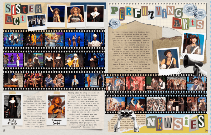
“Venture” - the vintage journal
Inspired by antique books, this yearbook theme includes 100 aged paper backgrounds plus 616 graphics including typewriter keys, delicate handwritten fonts, antique elements, and photo corners. The textures and photorealistic elements work well in layers with a handwritten or type-writer font. Like the maximalist approach above, remember the rules of design to keep it from looking cluttered.
A scrapbook yearbook theme works at any level, elementary, middle, or high school. It can look rustic and handmade. Retro and analog. Colorful and chaotic. Minimalist and soft. The best part? It doesn’t lock you into a single aesthetic—it's more of a concept than a rulebook.